
- In what ways does your media product use, develop or challenge forms and conventions of real media products?
Our video generally follows the forms and conventions of Hip Hop music videos. However, this is a difficult statement to make. Why?? Well, Hip Hop has not been around long, at max 40 years, originating in America in the 1970s. During this time, it is constantly evolving. The thing that needs to be understood about Hip Hop, is that it is not just a style of music. For some people, it is a lifestyle. Their fashion revolves around it, their jobs revolve around it, their homes revolve around it, their friends, their family, their cars, their food, even the way they speak. There are music and radio channels dedicated to Hip Hop and there have been many movies created with the genre of Hip Hop in the forefront. This is a huge leap from the urban nature of Hip Hop which was originated on the streets as a show of a pure talent with no fancy post production techniques involved what so ever, just pure expression.
Even with the constant refinement of Hip Hop in mind, we can still state that our video follows the general forms and conventions of other media productions in relation to the Hip Hop genre.
Please watch this introductory video we made specific to this evaluation question
Firstly, the most prominent aspect which our target audience and any other audience viewing our video would notice which follows the Hip Hop conventions would be the Mise En Scene.

This is a screen shot from close to the start of our video. As you can see, the actor on show is dressed very colourfully with blue trousers, a bright red puffer coat and a colourful tee. This epitomises the idea of hip hop that we tried to accomplish and show to our audience straight away. A large majority of hip hop artists create their image by trying to look the coolest, often bringing trends in from foreign countries or trying to create their own trends.
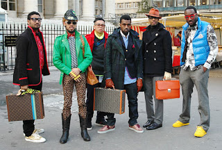
As you can see from the picture below, this is Kanye West, a megastar in the world of hip hop. He is pictured here with his entourage, all of which have to maintain a certain hip hop image. This is reflected in the way they dress. This emphasises the way our own music video follows the conventions of hip hop as we made sure that it was clear to the viewers that this was a hip hop video by immediately bringing to notice the fact that our actors were dressed in cool and urban clothing. This not only represented the idea of hip hip, but it also brought to attention the urban nature of our video, as it was one of Tinie Tempahs first songs before he had gone mainstream and he still had his urban roots.
Another aspect that our music video followed from similar media products was the theoretical side of things. We attempted to follow Andrew Goodwins theory, and we accomplished this in many ways. For instance, this video below is Asher Roth - I love college. He uses the link between lyrics and visualisations generally throughout the whole song, one part in particular being the lyrics "I can get pizza a dollar a slice." During this line, there is a cut to Asher Roth pulling out a slice of pizza in the middle of a party, indicating the link between lyrics and visualisations.
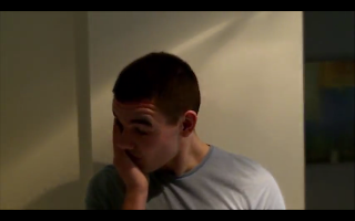
 Our media product follows this conventions of other media products as during the line "Tears won't fall from my eyes", we show a clip of a tear falling from the actors eye, and then being reversed so the tear drop shoots back up into the eye. (picture above). We thought that this is extremely effective as it not only reaches out to the emotional aspect of the audience, but it also helps the viewers make links in their own minds to the lyrics and the music, which would therefore give them an inclination into what is going in within the video if the lyrics match up with the clips.
Along with Goodwins theory, our media product follows the forms and conventions of other media products through a number of aspects. For instance, the use of camera angles and shots are an effective way to indicate how our media product is similar to those already out there. Again, with the image above of the tear falling, this represents emotion and may reach out to the audience. This is used a lot in other media products as they usually attempt to capture the audience in some way, and the most effective one is to pull on the heart strings or make them feel like there are in some way related to the events that are happening. With this in mind, we used a lot of shots and close ups which represented the emotion of the protagonist. For instance, we used a close up shot of him, showing how upset he was but how he was trying to hide his emotions, like a lot of people do in day to day situations.
As you can see from the picture below, this is Kanye West, a megastar in the world of hip hop. He is pictured here with his entourage, all of which have to maintain a certain hip hop image. This is reflected in the way they dress. This emphasises the way our own music video follows the conventions of hip hop as we made sure that it was clear to the viewers that this was a hip hop video by immediately bringing to notice the fact that our actors were dressed in cool and urban clothing. This not only represented the idea of hip hip, but it also brought to attention the urban nature of our video, as it was one of Tinie Tempahs first songs before he had gone mainstream and he still had his urban roots.
Another aspect that our music video followed from similar media products was the theoretical side of things. We attempted to follow Andrew Goodwins theory, and we accomplished this in many ways. For instance, this video below is Asher Roth - I love college. He uses the link between lyrics and visualisations generally throughout the whole song, one part in particular being the lyrics "I can get pizza a dollar a slice." During this line, there is a cut to Asher Roth pulling out a slice of pizza in the middle of a party, indicating the link between lyrics and visualisations.

Along with Goodwins theory, our media product follows the forms and conventions of other media products through a number of aspects. For instance, the use of camera angles and shots are an effective way to indicate how our media product is similar to those already out there. Again, with the image above of the tear falling, this represents emotion and may reach out to the audience. This is used a lot in other media products as they usually attempt to capture the audience in some way, and the most effective one is to pull on the heart strings or make them feel like there are in some way related to the events that are happening. With this in mind, we used a lot of shots and close ups which represented the emotion of the protagonist. For instance, we used a close up shot of him, showing how upset he was but how he was trying to hide his emotions, like a lot of people do in day to day situations.


This picture to the right shows Tinie Tempah obviously upset. This emphasises how our media product follows this form and convention of other media product as it clearly shows here between the two pictures that they have the same ideology to try to reach the audiences emotion.
Furthermore, as the song we used has quite a definitive beat to it, we used certain editing techniques to follow the conventions set from other media products. We did this by using jump cuts, or just basic cuts exactly at the beat as it is apparent from previous media products that this is a very effective technique to use. We also used different video effects to change the colours of the clips to enhance the ambience and mood of the setting to further the style of video we were hoping to achieve. This is done in other media products such as Flo Riders Good Feeling song, a lot of bright colours are used to create the sort of happy atmosphere and feel good motive that the song portrays. We used various darker colours and miserable tones within our video so that it influenced the way the audience thought about the actors and the situation.
On top of this, as we were trying to portray the conventions of a hip hop music video, we had to show clips both of the narrative aspect and of the rapper. This follows the general conventions of hip hop video, as the target audience would want to see the star of the video rapping his or hers song. However, unlike some music videos, we did not show the rapper rapping the whole of his verses, we kept cutting to different parts of it, so it did not break up the narrative aspect of it too much. A lot of hip hop videos do not have a narrative aspect to them, as there are so many lines and verses within the song it is hard to create a storyline amongst the lyrics. So therefore our music video can be seen to break certain generic conventions of other hip hop videos out there as we have managed to create a storyline within the video and have not simply just shown the artist rapping his song.
For our digipak, we followed the general conventions and forms of other digipaks out there, as we thought these were extremely effective, but we still attempted to bring our own twist onto it. Our digipak follows the forms of other products out there as we have the front cover as a simple picture of the protagonist in the video, with the name of the album/song and artist on the front. This is effective as it tells the audience exactly what they need and want to see straight away. Also, on the back cover, we added a list of the songs over the top of a picture that relates to the song. Furthermore, we added certain images to the back of the digipak which follows other forms and conventions of previous media products as this makes it look very effective. For instance, we added a label record, a copyright warning and a barcode, as these are not only present on other media products but they are generally required for a professional digipak. However, we did add a sticker page into our digipak as a sort of user-friendly aspect to get the audience more interested in the artist. This is not seen much in other media products, so we thought this would be a good idea to add a slight twist onto the generic conventions and forms.
Our magazine advertisement again follows the base set by other media products. For instance, it is simple but effective, as after researching other media products of this style, we found this was the most beneficial for the release of the song.

The style of our band homepage was influenced slightly by other media products, but we soon realised that a large majority of other homepages were completely different. We chose just to create one out of our own imagination, but still using other media products to see what sort of information was wanted/required by our target audience. For instance, we added a "Tour dates Information" section onto our homepage, as this is present on many artists homepages, naturally to help promote the artists tour to produce revenue. Also, we took our own take on the homepage as we used it to promote the song that we were covering. We placed a large banner at the top of the page with details about our song. This breaks certain conventions of other media products, as a large majority of the home pages we researched were pretty generic and basic, and you had to click on other links to try and find the new songs. We thought that it would be better to promote the song on the front page in which the viewers initially saw.
For all three of our ancillary projects, we kept the same colour layout and bases all near enough the same. This is a very effective technique that other media products use. As we had a certain colour (blue) which relates the the song title (tears), this would help the viewers relate the colours to the song, so if they saw a blue magazine advertisement somewhere, and they had already seen the website homepage, a link might be made in their minds between the two, so it would cause interest.
No comments:
Post a Comment