The Cast
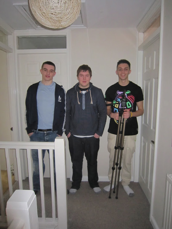
Me (Charlie Dennis) In Black T shirt to the right holding the tripod
Sunday, 1 April 2012
Saturday, 31 March 2012
Evaluation - Forms and conventions
- In what ways does your media product use, develop or challenge forms and conventions of real media products?
Our video generally follows the forms and conventions of Hip Hop music videos. However, this is a difficult statement to make. Why?? Well, Hip Hop has not been around long, at max 40 years, originating in America in the 1970s. During this time, it is constantly evolving. The thing that needs to be understood about Hip Hop, is that it is not just a style of music. For some people, it is a lifestyle. Their fashion revolves around it, their jobs revolve around it, their homes revolve around it, their friends, their family, their cars, their food, even the way they speak. There are music and radio channels dedicated to Hip Hop and there have been many movies created with the genre of Hip Hop in the forefront. This is a huge leap from the urban nature of Hip Hop which was originated on the streets as a show of a pure talent with no fancy post production techniques involved what so ever, just pure expression.
Even with the constant refinement of Hip Hop in mind, we can still state that our video follows the general forms and conventions of other media productions in relation to the Hip Hop genre.
Please watch this introductory video we made specific to this evaluation question
Firstly, the most prominent aspect which our target audience and any other audience viewing our video would notice which follows the Hip Hop conventions would be the Mise En Scene.
This is a screen shot from close to the start of our video. As you can see, the actor on show is dressed very colourfully with blue trousers, a bright red puffer coat and a colourful tee. This epitomises the idea of hip hop that we tried to accomplish and show to our audience straight away. A large majority of hip hop artists create their image by trying to look the coolest, often bringing trends in from foreign countries or trying to create their own trends.
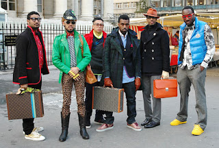
As you can see from the picture below, this is Kanye West, a megastar in the world of hip hop. He is pictured here with his entourage, all of which have to maintain a certain hip hop image. This is reflected in the way they dress. This emphasises the way our own music video follows the conventions of hip hop as we made sure that it was clear to the viewers that this was a hip hop video by immediately bringing to notice the fact that our actors were dressed in cool and urban clothing. This not only represented the idea of hip hip, but it also brought to attention the urban nature of our video, as it was one of Tinie Tempahs first songs before he had gone mainstream and he still had his urban roots.
Another aspect that our music video followed from similar media products was the theoretical side of things. We attempted to follow Andrew Goodwins theory, and we accomplished this in many ways. For instance, this video below is Asher Roth - I love college. He uses the link between lyrics and visualisations generally throughout the whole song, one part in particular being the lyrics "I can get pizza a dollar a slice." During this line, there is a cut to Asher Roth pulling out a slice of pizza in the middle of a party, indicating the link between lyrics and visualisations.
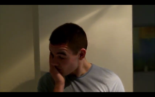
Our media product follows this conventions of other media products as during the line "Tears won't fall from my eyes", we show a clip of a tear falling from the actors eye, and then being reversed so the tear drop shoots back up into the eye. (picture above). We thought that this is extremely effective as it not only reaches out to the emotional aspect of the audience, but it also helps the viewers make links in their own minds to the lyrics and the music, which would therefore give them an inclination into what is going in within the video if the lyrics match up with the clips.
Along with Goodwins theory, our media product follows the forms and conventions of other media products through a number of aspects. For instance, the use of camera angles and shots are an effective way to indicate how our media product is similar to those already out there. Again, with the image above of the tear falling, this represents emotion and may reach out to the audience. This is used a lot in other media products as they usually attempt to capture the audience in some way, and the most effective one is to pull on the heart strings or make them feel like there are in some way related to the events that are happening. With this in mind, we used a lot of shots and close ups which represented the emotion of the protagonist. For instance, we used a close up shot of him, showing how upset he was but how he was trying to hide his emotions, like a lot of people do in day to day situations.
As you can see from the picture below, this is Kanye West, a megastar in the world of hip hop. He is pictured here with his entourage, all of which have to maintain a certain hip hop image. This is reflected in the way they dress. This emphasises the way our own music video follows the conventions of hip hop as we made sure that it was clear to the viewers that this was a hip hop video by immediately bringing to notice the fact that our actors were dressed in cool and urban clothing. This not only represented the idea of hip hip, but it also brought to attention the urban nature of our video, as it was one of Tinie Tempahs first songs before he had gone mainstream and he still had his urban roots.

Another aspect that our music video followed from similar media products was the theoretical side of things. We attempted to follow Andrew Goodwins theory, and we accomplished this in many ways. For instance, this video below is Asher Roth - I love college. He uses the link between lyrics and visualisations generally throughout the whole song, one part in particular being the lyrics "I can get pizza a dollar a slice." During this line, there is a cut to Asher Roth pulling out a slice of pizza in the middle of a party, indicating the link between lyrics and visualisations.
Along with Goodwins theory, our media product follows the forms and conventions of other media products through a number of aspects. For instance, the use of camera angles and shots are an effective way to indicate how our media product is similar to those already out there. Again, with the image above of the tear falling, this represents emotion and may reach out to the audience. This is used a lot in other media products as they usually attempt to capture the audience in some way, and the most effective one is to pull on the heart strings or make them feel like there are in some way related to the events that are happening. With this in mind, we used a lot of shots and close ups which represented the emotion of the protagonist. For instance, we used a close up shot of him, showing how upset he was but how he was trying to hide his emotions, like a lot of people do in day to day situations.

This picture is a good example of this technique, as it clearly shows the emotion of the protagonist.
This picture to the right shows Tinie Tempah obviously upset. This emphasises how our media product follows this form and convention of other media product as it clearly shows here between the two pictures that they have the same ideology to try to reach the audiences emotion.
Furthermore, as the song we used has quite a definitive beat to it, we used certain editing techniques to follow the conventions set from other media products. We did this by using jump cuts, or just basic cuts exactly at the beat as it is apparent from previous media products that this is a very effective technique to use. We also used different video effects to change the colours of the clips to enhance the ambience and mood of the setting to further the style of video we were hoping to achieve. This is done in other media products such as Flo Riders Good Feeling song, a lot of bright colours are used to create the sort of happy atmosphere and feel good motive that the song portrays. We used various darker colours and miserable tones within our video so that it influenced the way the audience thought about the actors and the situation.
On top of this, as we were trying to portray the conventions of a hip hop music video, we had to show clips both of the narrative aspect and of the rapper. This follows the general conventions of hip hop video, as the target audience would want to see the star of the video rapping his or hers song. However, unlike some music videos, we did not show the rapper rapping the whole of his verses, we kept cutting to different parts of it, so it did not break up the narrative aspect of it too much. A lot of hip hop videos do not have a narrative aspect to them, as there are so many lines and verses within the song it is hard to create a storyline amongst the lyrics. So therefore our music video can be seen to break certain generic conventions of other hip hop videos out there as we have managed to create a storyline within the video and have not simply just shown the artist rapping his song.
For our digipak, we followed the general conventions and forms of other digipaks out there, as we thought these were extremely effective, but we still attempted to bring our own twist onto it. Our digipak follows the forms of other products out there as we have the front cover as a simple picture of the protagonist in the video, with the name of the album/song and artist on the front. This is effective as it tells the audience exactly what they need and want to see straight away. Also, on the back cover, we added a list of the songs over the top of a picture that relates to the song. Furthermore, we added certain images to the back of the digipak which follows other forms and conventions of previous media products as this makes it look very effective. For instance, we added a label record, a copyright warning and a barcode, as these are not only present on other media products but they are generally required for a professional digipak. However, we did add a sticker page into our digipak as a sort of user-friendly aspect to get the audience more interested in the artist. This is not seen much in other media products, so we thought this would be a good idea to add a slight twist onto the generic conventions and forms.
Our magazine advertisement again follows the base set by other media products. For instance, it is simple but effective, as after researching other media products of this style, we found this was the most beneficial for the release of the song.
This magazine advertisement is one that appealed mostly to us, so we chose to follow its base format. We did this as it is simple, but it does not need any more information as it tells the viewer everything that is needed. Our magazine advertisement followed this as we only put the information on that was needed so that if people were just quickly glancing at the advert, they would instantly get the key information. However, we went one step further from an advertising point of view. On our magazine, we promoted the bands homepage, so that if people wanted to get more involved, they could. Also, we promoted Facebook and twitter on this, as it is highly probably that our target audience would have these social networking sites, so this would definitely appeal to the viewers.
The style of our band homepage was influenced slightly by other media products, but we soon realised that a large majority of other homepages were completely different. We chose just to create one out of our own imagination, but still using other media products to see what sort of information was wanted/required by our target audience. For instance, we added a "Tour dates Information" section onto our homepage, as this is present on many artists homepages, naturally to help promote the artists tour to produce revenue. Also, we took our own take on the homepage as we used it to promote the song that we were covering. We placed a large banner at the top of the page with details about our song. This breaks certain conventions of other media products, as a large majority of the home pages we researched were pretty generic and basic, and you had to click on other links to try and find the new songs. We thought that it would be better to promote the song on the front page in which the viewers initially saw.
For all three of our ancillary projects, we kept the same colour layout and bases all near enough the same. This is a very effective technique that other media products use. As we had a certain colour (blue) which relates the the song title (tears), this would help the viewers relate the colours to the song, so if they saw a blue magazine advertisement somewhere, and they had already seen the website homepage, a link might be made in their minds between the two, so it would cause interest.
This picture to the right shows Tinie Tempah obviously upset. This emphasises how our media product follows this form and convention of other media product as it clearly shows here between the two pictures that they have the same ideology to try to reach the audiences emotion.
Furthermore, as the song we used has quite a definitive beat to it, we used certain editing techniques to follow the conventions set from other media products. We did this by using jump cuts, or just basic cuts exactly at the beat as it is apparent from previous media products that this is a very effective technique to use. We also used different video effects to change the colours of the clips to enhance the ambience and mood of the setting to further the style of video we were hoping to achieve. This is done in other media products such as Flo Riders Good Feeling song, a lot of bright colours are used to create the sort of happy atmosphere and feel good motive that the song portrays. We used various darker colours and miserable tones within our video so that it influenced the way the audience thought about the actors and the situation.
On top of this, as we were trying to portray the conventions of a hip hop music video, we had to show clips both of the narrative aspect and of the rapper. This follows the general conventions of hip hop video, as the target audience would want to see the star of the video rapping his or hers song. However, unlike some music videos, we did not show the rapper rapping the whole of his verses, we kept cutting to different parts of it, so it did not break up the narrative aspect of it too much. A lot of hip hop videos do not have a narrative aspect to them, as there are so many lines and verses within the song it is hard to create a storyline amongst the lyrics. So therefore our music video can be seen to break certain generic conventions of other hip hop videos out there as we have managed to create a storyline within the video and have not simply just shown the artist rapping his song.
For our digipak, we followed the general conventions and forms of other digipaks out there, as we thought these were extremely effective, but we still attempted to bring our own twist onto it. Our digipak follows the forms of other products out there as we have the front cover as a simple picture of the protagonist in the video, with the name of the album/song and artist on the front. This is effective as it tells the audience exactly what they need and want to see straight away. Also, on the back cover, we added a list of the songs over the top of a picture that relates to the song. Furthermore, we added certain images to the back of the digipak which follows other forms and conventions of previous media products as this makes it look very effective. For instance, we added a label record, a copyright warning and a barcode, as these are not only present on other media products but they are generally required for a professional digipak. However, we did add a sticker page into our digipak as a sort of user-friendly aspect to get the audience more interested in the artist. This is not seen much in other media products, so we thought this would be a good idea to add a slight twist onto the generic conventions and forms.
Our magazine advertisement again follows the base set by other media products. For instance, it is simple but effective, as after researching other media products of this style, we found this was the most beneficial for the release of the song.
The style of our band homepage was influenced slightly by other media products, but we soon realised that a large majority of other homepages were completely different. We chose just to create one out of our own imagination, but still using other media products to see what sort of information was wanted/required by our target audience. For instance, we added a "Tour dates Information" section onto our homepage, as this is present on many artists homepages, naturally to help promote the artists tour to produce revenue. Also, we took our own take on the homepage as we used it to promote the song that we were covering. We placed a large banner at the top of the page with details about our song. This breaks certain conventions of other media products, as a large majority of the home pages we researched were pretty generic and basic, and you had to click on other links to try and find the new songs. We thought that it would be better to promote the song on the front page in which the viewers initially saw.
For all three of our ancillary projects, we kept the same colour layout and bases all near enough the same. This is a very effective technique that other media products use. As we had a certain colour (blue) which relates the the song title (tears), this would help the viewers relate the colours to the song, so if they saw a blue magazine advertisement somewhere, and they had already seen the website homepage, a link might be made in their minds between the two, so it would cause interest.
Thursday, 29 March 2012
Evaluation - Audience Feedback
Audience feedback has been a vital part throughout the whole process of making the music video. It really did make us aware of making sure we got it. Our audience feedback started as soon as thought of the song that we were going to use. The first thing we did including audience feedback was a questionnaire of the song that we did, we did the questionnaire to a variety of our friends not in our group. The questionnaire included the questions on the front and the song lyrics on the back, we also played the song out too, this questionnaire helped us gain ideas for the music video including what thought and feeling they thought of the song. Also, after understanding what groups liked the song and what ages they were. This was a vital part of our planning as it helped us realize what the target audience were and what they thought about the song.
During the second process of our audience feedback we continues to carry on with the development of the music video, this included showing our target audience short snaps of our video and seeing what they thought about it. This process helped us make our music video as professional as we could, as it helped us realize what the audience were looking for and what parts they liked/didn't. A example of using audience feedback was with the start part of the music video, originally that part wasn't there, but quite a few people suggested that it would be helpful there as it gives the audience a feeling of what had just happened, setting the scene. With this we developed the audience's ideas even more in order to keep the music video original and fresh.
The next process was to finalize the music video and show it to the audience. To find out if our video was successful or not we decided to get the video as our there as we could, so we took to one of the most popular media devices out there, Facebook, here we could attract a large scale audience. With Facebook I made a simple post on my news-feed asking for feedback:
Within minutes I started getting positive feedback on what was good about our music video, this was helpful as is was clear that the music video was a success and that people liked it, also, by getting the video having more likes on YouTube it would become more popular when people search specific words:
With our music video we also looked for some constructive critism on where we could improve our video, the below picture gave us some ways we could improve our video if we were to release another edit of the video:
With sending our music video out onto Facebook within five minuets that we put it out there the video went from 7 views up to 31, this showed a rapid increase of viewers of the music video:
To gain even more feedback we then decided to create a questionnaire to give out to the specified audience, with this questionnaire we hoped to gain valuable information of what they thought of the video and what else could be improved, thankfully nearly all of the comments were positive indicating that the music video was successful:
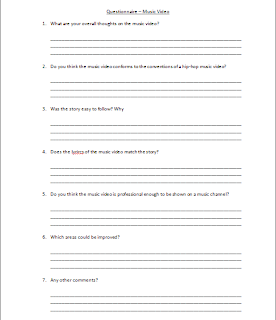
This is an example of the questionnaire given out, with the questions we didn't want to make too many as we wanted the questions stay on track with the music video.
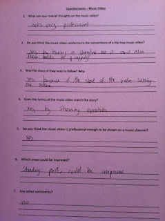
And
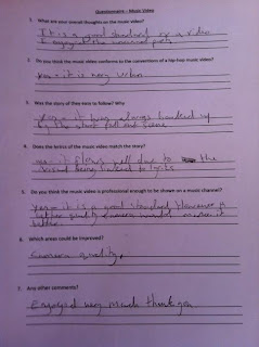
Both these two questionnaire's we received back both look extremely positive showing good feedback to the video, is was extremely vital that we got this type of feedback, so we knew if we needed to improve anything, both these examples show that nothing was really necessary to change and that the video was good.
To conclude, I believe that that as a group we learnt so much from audience feedback, it helped us throughout the various stages of our music video and ancillary tasks, during the feedback stage we learnt that we needed to make the story more clear, so we did that little introduction at the star, and also in the final post production stages we learnt what we could have added/improved on but also we learnt what we did successful.
Evaluation - Combination of Main Product and Ancillary
How effective is the combination of your main product and ancillary tasks?
Throughout the year the process of creating the main product of a video and the ancillary tasks have been created side by side. The ancillary tasks were to create a Digipak, magazine article and a website page. These in relation to the music video was a great combination to research and investigate modern media.
The first ancillary task are group undertook was the creation of the digipak, this creation was a interesting product to create because it had so much that could be related with the main product. The theme colour of the digipak was blue this represented tears which combines to the lyrics in the music video. We also found that the digipak was very artistic. Research into many different artists digipaks showed us how creative we can be with it relating it to the main product in many different ways. This is what we did, we also related the digipak to the protagonist in the music video by using a picture of him with effects around it:
This combination between the digipak and music video was a very good relation to produce ideas for are specific theme and video.
The website also had a great combination between the main product and the creation of the website. It was mainly a good combination due to the thought of different ways to hit the audience with are products. In later days media is becoming the main way to sell your product this could be from sites such as eBay and amazon. Having are own website page would mean that it would bring a wider audience all to one place. The combination that the website has with the creation of the music video his huge because without the website it would be downgrading the potential of audience that we would get with this website.
To make the video even more popular we have created Facebook and twitter links on the website so the fans could simply follow through either one of these. This would give the website potential to be seen by many different people even famous people.
The magazine article combination with the main product had also had a massive impact on how much media can grab an audience. The combination between the two is that the product we created had to be sold and a magazine article is possibly one of the most effective ways to put across little amounts of important information to the audience.
As you can see from the picture, that are magazine article shows key information of when you can 'pre-order' a copy of the album this is very constructive in relation to selling the main product.
All the ancillary tasks have a massive combination with the main product. They all relate efficiently with the main product which makes them very useful. as an overview we have really enjoyed the ancillary tasks as they surround the main product with advertisement.
Evaluation - Media Technologies
Media completely revolves around us in our day-to-day life. It is constantly evolving. Without these new media technologies, none of the pre-production, post-production, planning or research for our media products would be possible.
Construction
Growing up in this generation means that we have
been exposed to huge amounts of different media technologies. This was
incredibly useful in the construction aspect of our media products.
 We had 2 flip cameras to use during the filming of
our video. One was a Vado HD, and one was a Kodak PlaySport which was my own.
We started using the Vado HD camera, which was a pretty decent camera. It was
small, it managed to fit onto the tripod we had and it took recordings in 1080p
high quality audio and video. However, we decided to begin the editing whilst
still in the filming process. Once we tried to upload the videos onto the
computer, they imported in a AVI format, which iMovie does not support. So we
then had to switch the the Kodak PlaySport which imported the videos in a much
more manageable MP4 format.
We had 2 flip cameras to use during the filming of
our video. One was a Vado HD, and one was a Kodak PlaySport which was my own.
We started using the Vado HD camera, which was a pretty decent camera. It was
small, it managed to fit onto the tripod we had and it took recordings in 1080p
high quality audio and video. However, we decided to begin the editing whilst
still in the filming process. Once we tried to upload the videos onto the
computer, they imported in a AVI format, which iMovie does not support. So we
then had to switch the the Kodak PlaySport which imported the videos in a much
more manageable MP4 format.The computer we used to upload the videos onto was a MacBook Pro, which was my own.

We did have use of a school computer, which was also a MacBook. However, mine was a newer model with the latest software installed so this proved to be a much more useful product to use.
Originally, we imported the videos onto editing
software called iMovie. We had a years experience editing on iMovie thanks to
our media studies lessons. iMovie was extremely fun to use, as we were
constantly learning new things and adding the effects and once after adding the
music to the clips and it all starting coming together, it was very enjoyable.
Although during the initial stages, as the Vado HD camera imported files into
the AVI format, we had to download certain converters on the MacBook in order
to get the files onto iMovie. This was a lengthy process and required a lot of
research and downloading of apps to find one that eventually worked quickly and
effectively.
 However, I
downloaded the trial version of Final Cut Pro X after seeing it on the Mac App
Store. The actual full version of this is around £200. Unfortunately, I only
became aware of the trial version after I had nearly finished editing the
video. I proceeded to upload the iMovie production onto Final Cut Pro X anyway,
and this proved useful, as it was an extremely professional software with a
much larger choice of editing techniques. We chose a professional looking title
sequence along with other minor adjustments to our video.
After completely the editing process using a
variety of iMovie and Final Cut Pro X, we exported the video. There were many
different options to export the video onto. We chose to use multiple versions
just so that we could have backups and even re-export them if ever needed.
Although it is a slightly dated media technology,
we exported a version of our video to iDVD, which we then burned onto a disk so
that we had a physical hard copy of the media product. We then proceeded to
upload the video onto the main media technology in which we would use to get
our video across to our audience. This was YouTube, which would provide us with
the easiest media technology to get our video across. We also exported it to
QuickTime Pro and to iTunes, so we had back up copies.
We also used iTunes to not only get the song we
used, but to edit it slightly so that the song started at the right place. On
top of this we used GarageBand to edit the song to take out a full verse, which
made the song a much more manageable length.
Whilst in the filming process, we used our mobile
phones to play the song so that it was easy to keep to the beat whilst
pretending to rap to the video. Furthermore, we used our mobile phones to keep
on track with each other so that the arrangements for the filming times were on
track to help us keep organised.
Research + Planning
For the research aspect, the most useful media
technology to use was the Internet. We used Google largely to research
information about our genre of video, and to research about theorists and other
aspects that were useful into the pre-production of the video. However, we also
used YouTube to research possible song ideas and other video productions.
We also used Google and Youtube to plan. This
helped us get valuable information needed to create our video.
We thought that we would stick to the technological
side of things instead of using pen and paper and creating storyboards as none
of us are good at drawing or handwriting, and so we thought this would be a
pointless exercise. However we did use a printer to print off our questionnaire
we had created. This meant that it was easy to distribute to our potential
target audience so they could fill it in with ease.
However this posed us with a problem, as we then
needed to get it on the computer. So we chose to take pictures of them instead
of scanning and upload.
We used Facebook and Twitter to exchange ideas that
we had thought up of in the planning aspect, and sent each other links for
videos that we thought we very effective.
Also, we created lists and a filming call sheet on
Word to help us keep organized.
For our ancillary tasks, we went into HMV to see
what sorts of digipaks were already out there. We also tried to find magazines
that may contain album advertisements; although we were unsuccessful we did
find other magazine advertisements that did help us. Again we used the Internet
to find previous website homepages to help us in the production of our own.
Evaluation
For the evaluation side, we used the website
Blogger.com to collaborate all of our ideas together and to keep organized and
on track with out work. This was a very effective media technology to use, as
not only did it help us keep organized, but we could also add pictures, embed
videos, share links to Prezi slides and much much more. We could also easily
share our work with the other members of our group in order to help us see if
we were all keeping on track with the work. Also again we used Facebook Twitter
and YouTube to gather all our audience feedback that we had obtained after
sharing our video.
Wednesday, 28 March 2012
Ancillary Task - Website Homepage
This is the final design for the website page. For this website page I used the program Photoshop With this website page I made sure that we advertised as much as we could, such as having the little boxes at the top such as Facebook, Twitter and YouTube to let the audience know we had all these types of pages, I think this was successful as the images were clear to what one you wanted to choose, this ]also helped the audience contact in anyway they wanted if they had any questions or feedback. I also added a registration to the website, this made it possible for the audience top subscribe to the website for any latest news on things such as tour dates and when tickets go on sale. Also with the website I made sure it attracted to the target audience (12-25 year olds). This was successful as it it didn't have too much on the page that people would miss and also that the information they needed was clear. I also added the music video we made to show the audience what type of music they would be listening too at the tours. The use of the flags on the bottom left hand side of the page was also useful, as we hoped our website would attract a wide range of different people from different countries, and if they were attracted they would be able to read the website in their preferred language, this also allowed them to see if there were any tours in their specified country.
Ancillary Task - Digipak
Front Cover:
The Ancillary task of creating a digipak, was a very enjoyable task. I have researched into many different digipaks from a variety of different artists. This is our album cover:
This cover is very simple but effective. I have used a picture application to create a more vivid look of the protagonist to use as the front cover. To create this picture I started off by taking a picture of the protagonist. Then using photoshop added effects such as colour toning.
After researching into many artists album covers, I realised that the most effective of the covers were simple but with a good graphical design of either the artist or something surrounding the artist.
This is what I have created for our album cover, the effect it should have on the audience is to straight away be able to notice that it is are album. Relating the album to the protagonist in the music video will give the audience a connection, making it stand out, if for example it was in a album shop, if the audience didn't know what they name of the song was they maybe able to pick it up due to knowing the artist.
Back Cover:
The back cover is very interesting, as it contains many notifications that people may not see. It also provides the details to what songs are included in the album.
The back cover to the album was the most time consuming creation of the covers. The cover needs to contain the songs that are in the album and who it may feature. To make it easy access to the audience, I added a colour to the number of each song to make it clear. I also added a bold font design to the name of the song so it stands out and is eye catching if the audience is looking for one particular song.
The Background design that is on the back cover is very effective. It is a very simple picture of a droplet falling into water but it represents more than that to the audience.
It represents a tear drop that is the main significance of the song that we produced. It also creates a amplification of a speaker as the waves ripple into a circle in the same way sound moves.
Lots of piracy continues to happen in the modern day of media. This can be from free downloading of songs, to the recording and selling of films. However it is being monitored by the FBI and now every album that has been produced has to have a copyright certificate to ensure that the product is sold for the creators gain.
This certificate is shown at the bottom of the back cover with small righting confirming the terms of the conditions.
To make the back cover even more professional I have added a bar code to show exactly how the package would look in a shop and where I would locate the bar code.
Side Bar:
This would be down the thin side of the album cover. I have made it again simple. This shows the artist name and I also added a Brit Award production image at the bottom to show that it is an award winning Artist which again may bring a wider audience as this is a respected award.
Sticker Page:
Part of the digipak that I thought of was a stickers page. I thought this would be a great opportunity to add a further piece of advertising to our target audience. These stickers could be stuck on cars or in a room etc. This is effective as it could bring more notice to Tinie Tempah, and more specifically, our song. These pictures could even produce money, for example if someone looked at the T-Shirt they would maybe like to buy.
The stickers would also show a true fan and people like to display if they really like an artist which makes stickers a great use of advertisement.
Lyrics page:
This part of the digipak is a lyrics page. This is effective as an audience may want to know the lyrics to the song. I have used a drawn background of a eye tearing to stick to the blue coloured theme. This picture is also simple to try and keep the text easy to read.
The lyrics can often be found in many professional digipak's this is why I have added it to are digipak. I have placed chorus where the chorus is to make it less writing when people are reading the digipak to find there certain lyrics.
Ancillary Task - Magazine Advertisement
This is the final magazine advertisement. As you can see, it is extremely effective as all the most important aspects of this advertisement stand out, even from a distance. This is what is needed for an effective magazine advert, as it needs to catch the audiences eye and give off the information in a short amount of time as the majority of people looking at the advert will only briefly look at it. With this is mind, we decided not to have too much information on it, as there is a large chance that people would not linger on the advert. However, we have tried to maximise the amount of time that people will view our advert as we have made it very simple but effective. The blue on white colour scheme makes it extremely easy to look and is not a sore sight for eyes. Also, we added a very neutral but effective image of the artist as the heading. This is because he is a quite well known figure, and as people are extremely interested in celebrities, this would intrigue them. It has everything that is needed for a good advert, with links as to where people may find additional information for the release of the single.
Subscribe to:
Comments (Atom)


